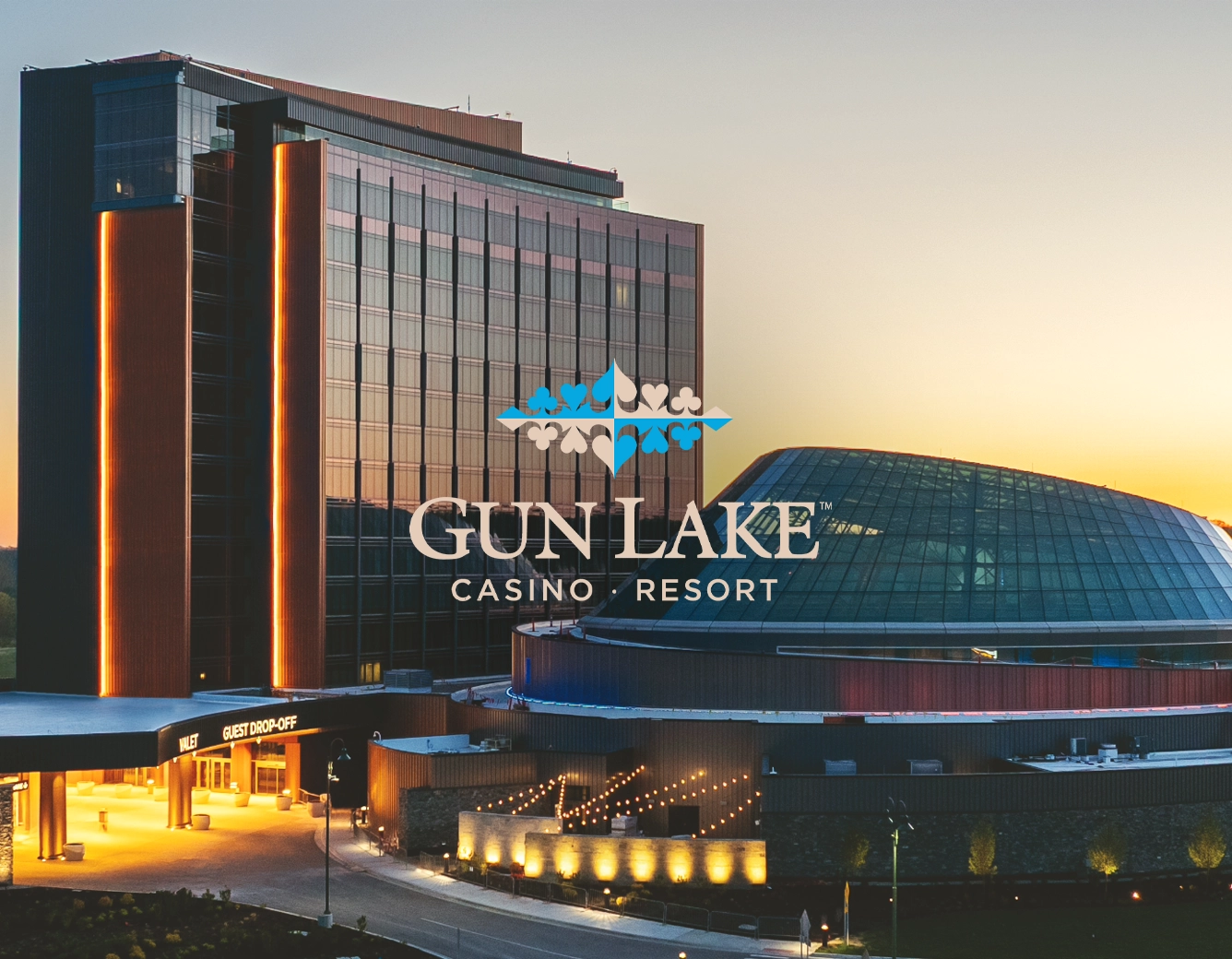
While at Gun Lake Casino Resort, I served as Graphic Designer II, where I was directly responsible for the monthly creation of promotional materials, including emails, social media and on property digital advertisements. In addition, we regularly updated and maintained the menus and in venue advertising for 6 different dining operations. As a casino is a 24/7 operation, this meant I needed to be able to move quick and jump on opportunities as they showed up. GLCR was a wonderful chance to stretch my creative problem solving, and find opportunities for optimization
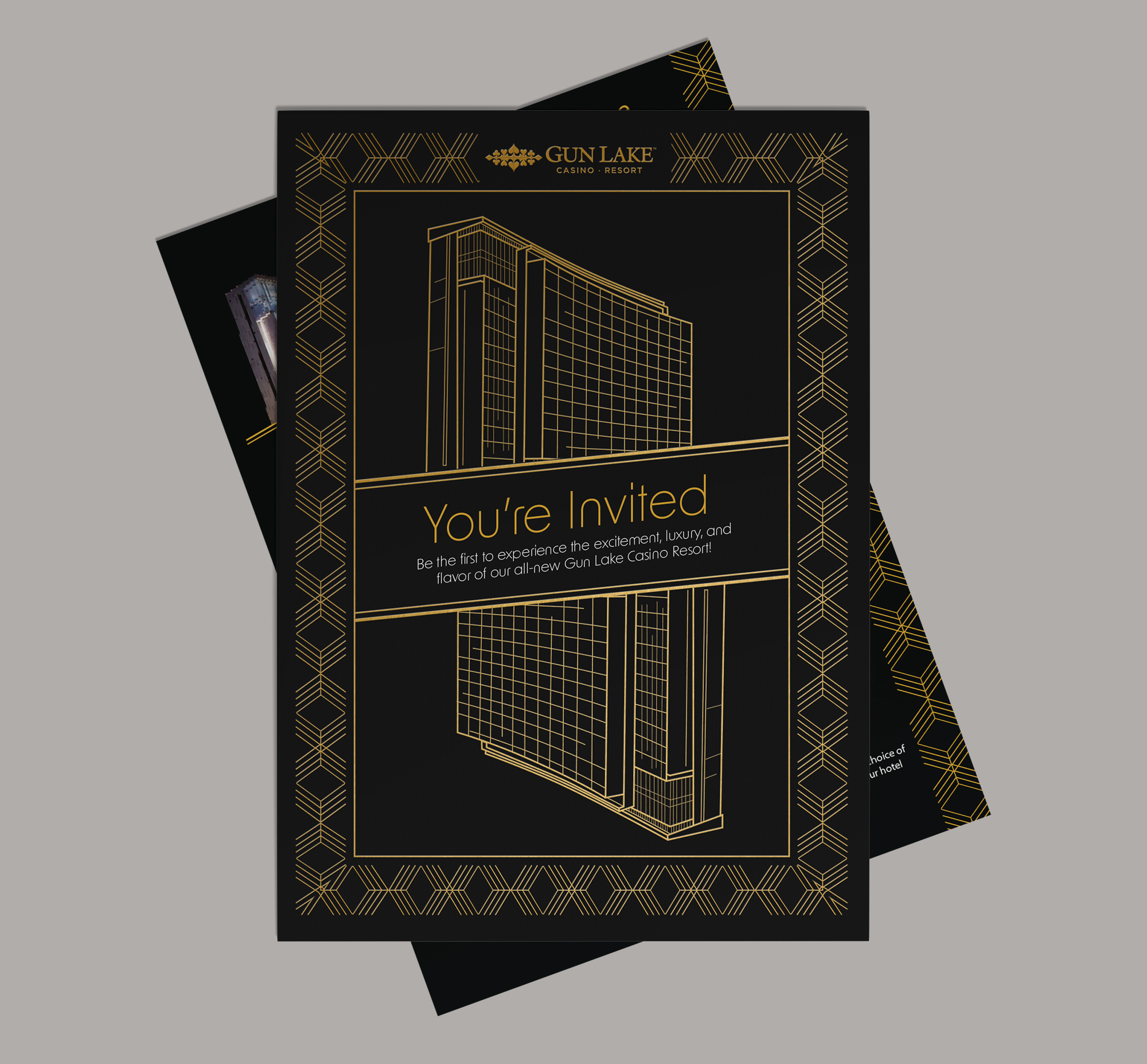
GLCR, was situated in a unique position, being more than 20 minutes away from a major city, visitors were mostly local if they were regular. This meant we needed to be inticing, and direct with our attempts to draw in a larger audience, which ultimately lead to the grand opening of the Hotel and Wawye Oasis. I was lucky enough to be a part of the planning and execution of that grand opening.
With 6 different dining venues, over 10 different monthly promotions (amounting to roughly 80+ pieces of content created monthly), and consistent on-going property advertising campaigns, Gun Lake Casino Resort was a cornucopia of varied designs and varied audiences. The major challenges I sought to solve were:
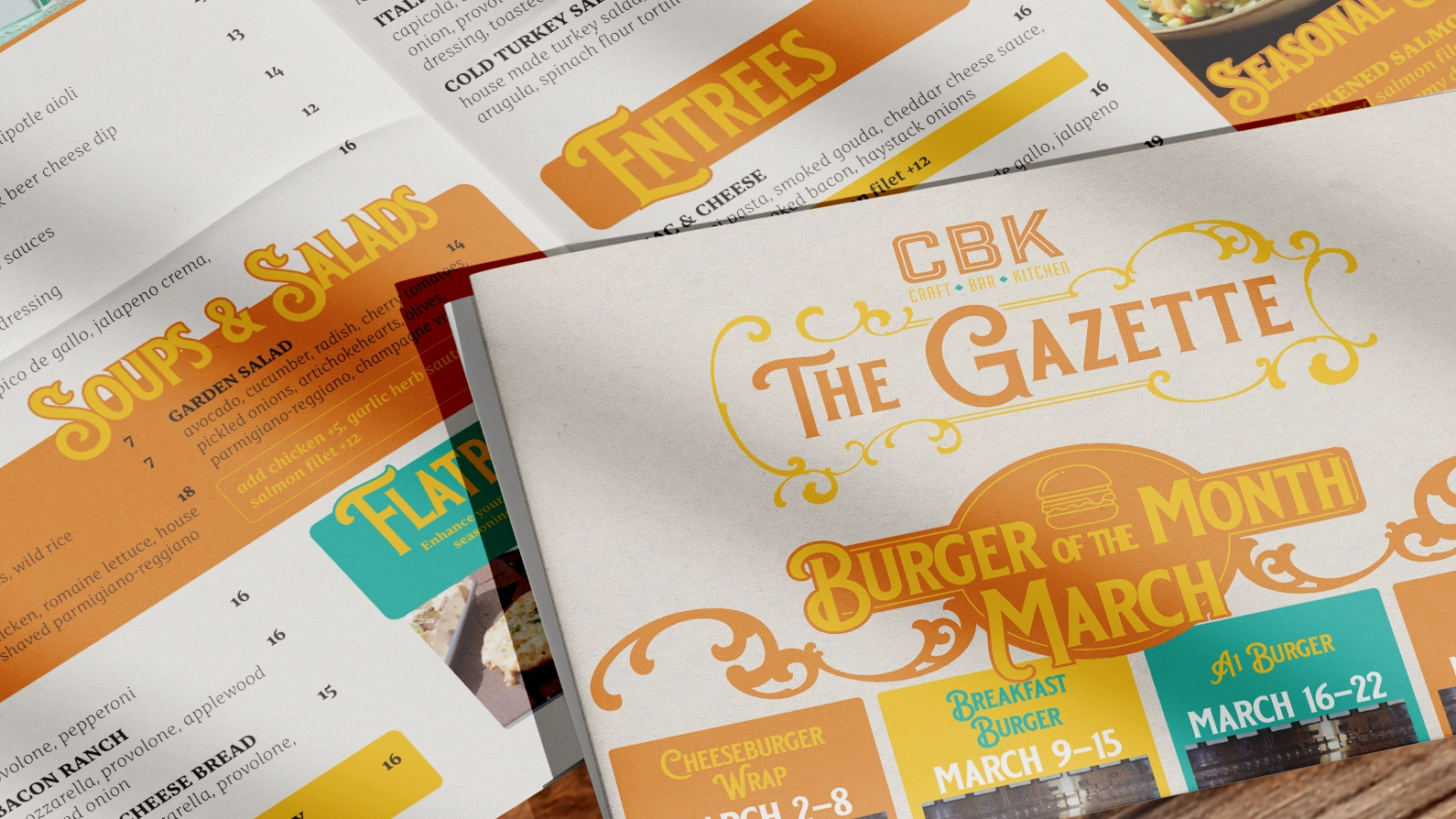
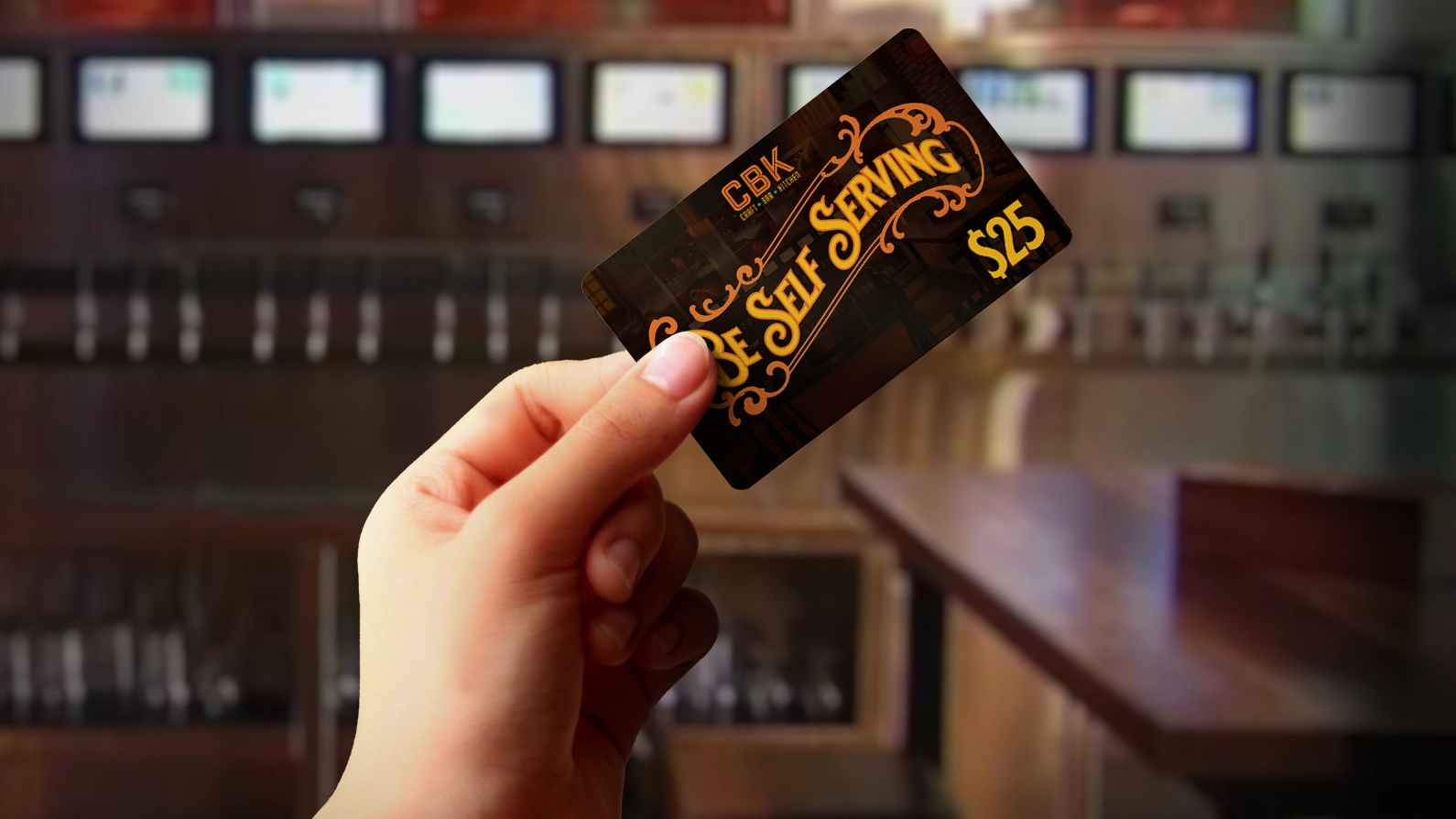
CBK was one of our many dining venues, and as it was very centrally situated to the gaming floor it was important that the atmosphere it provided was inviting. CBK sits opposite the property's high-end steakhouse, and while they aren't inherently competitors, we did want to make sure it put out a familiar hometown energy. CBK's lighting is warm, its beer is cold, and the game is always on. So for its design, I wanted to make sure it was warm, welcoming and nostalgic. For that point, I utilized nostalgic fonts, like Blackriver, and 20s inspired embelishments.
The most unique problem to solve with CBK was it's rotating, often updated menu. There were plenty of promotions that needed to be advertised, specials to be featured, and items to be altered month to month. Often, this meant going in, editting the menu, and getting it reprinted multiple times, not even taking into account damaged menus on tables. The solution? Newsprint. Newsprinting is more cost-effective and feels more familiar, like eating dinner at the family table. We were able to utilize the larger format to feature more cross-property ads, push more special menus, and get all of this printed for a fraction of our costs. All with the upside of a nostalgic, but unique experience..
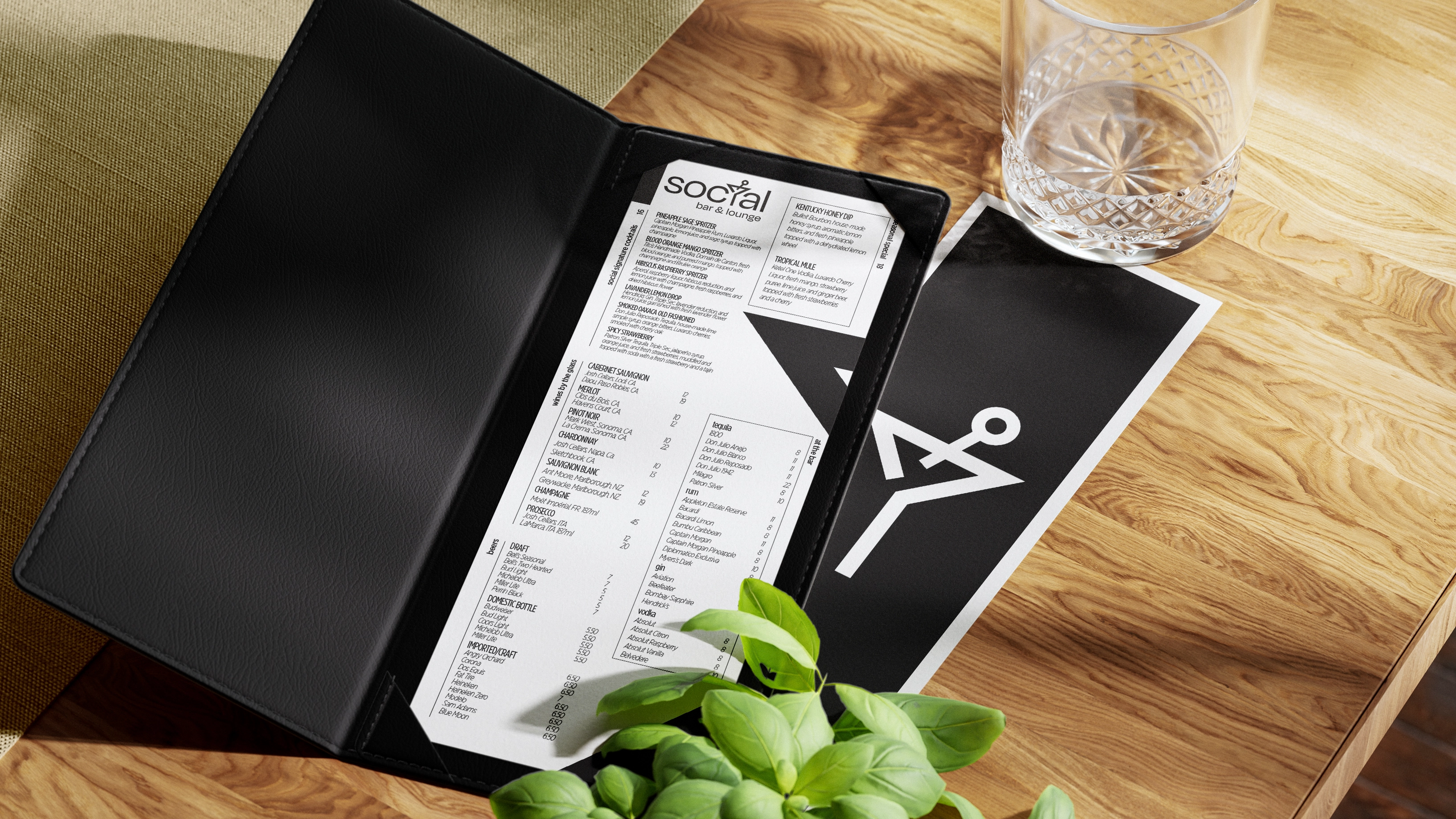
Socialize and unwind. Enjoy craft cocktails and lively conversation in a relaxed, inviting atmosphere.
Social Bar & Lounge was a particularly fun and exciting project, as I got the chance to be apart of the naming and design of the venue, right from the start of the project. The marketing department had the chance to pitch names, and designs as the property moved towards expansion and the chance to add this venue to the guest experience.
For Social, we wanted a modern, clean, and elegant design. Social's location is front and center near one of the property's main entrances, and greets guests with a massive LED 'Selfie Wall' inviting them to stay and hang out with friends. For Social, I wanted to keep all of the designs as clean and simple as possible, mimicking the city life that people come to GLCR for a taste of.
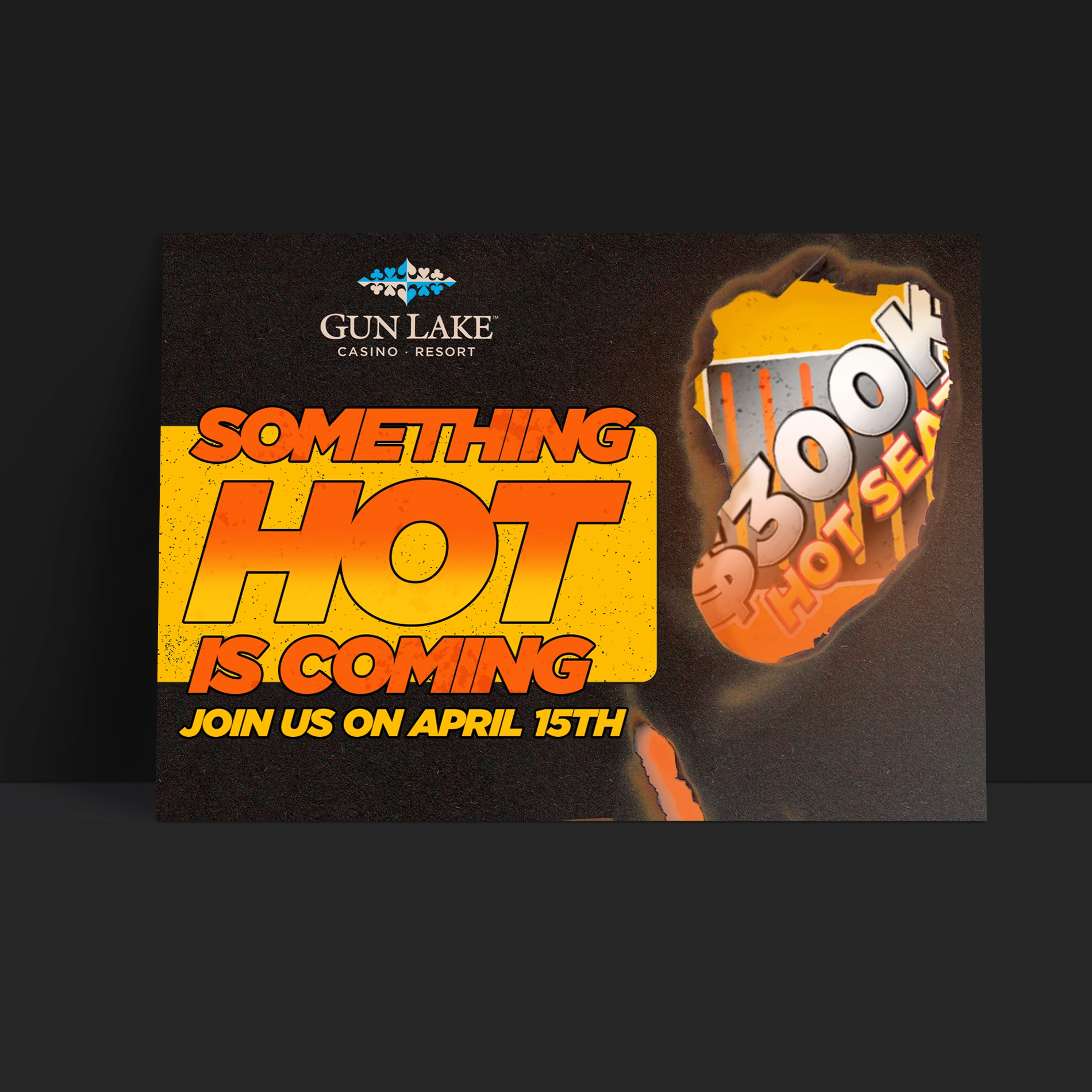
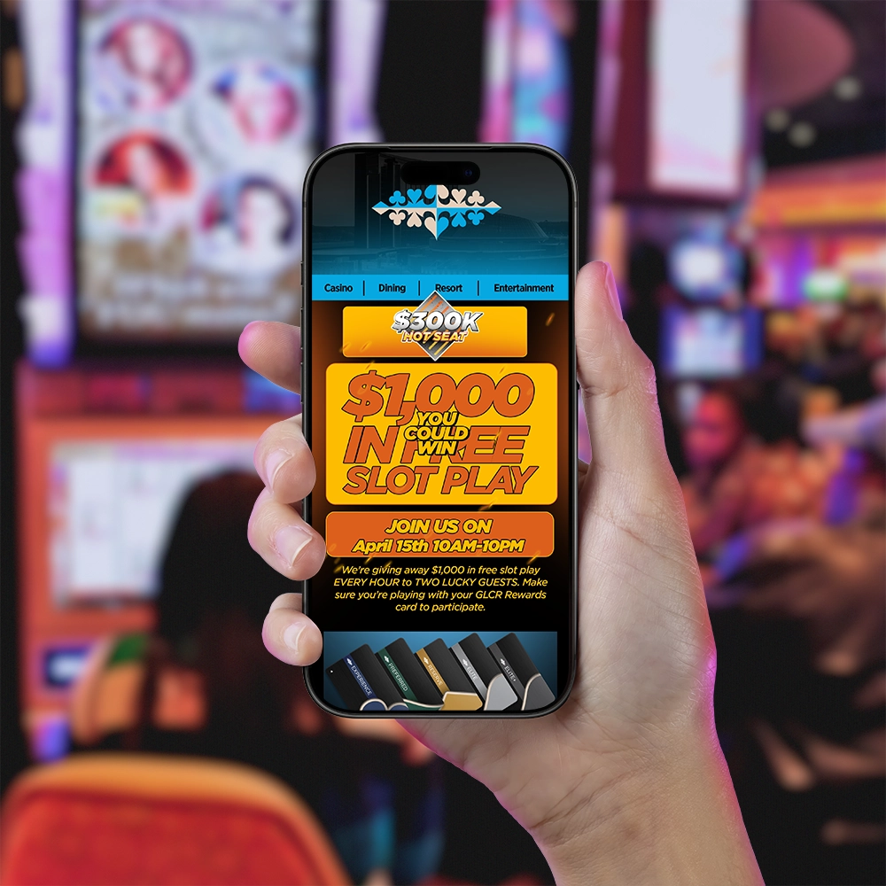
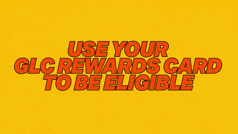
Every month, GLCR sends out dozens of touchpoint promotions to guests, rewards members, and prospective guests. Some of these have unique promotions, meant to attract a specific group, others like the monthly mailer, simply feature the months worth of promotions and events happening on property.
In order for these promotions to be successful, it was important that a guest could recognize the information they needed across multiple mail pieces, emails, social media, and on property digital displays. This presented a unique challenge month to month: rapid creation of over 80 pieces of content, while also creating something eye-catching enough to draw in visits and return visits from customers. It was an incredibly fun chance to optimize workflows in a way that allowed for more time to create those more energetic designs. I worked with my team to create templates and workflows that allowed us to bring our completion timelines from 3 weeks, to 1 week for production time on digital assets.